Creating a dynamic brand identity for a SciTech startup
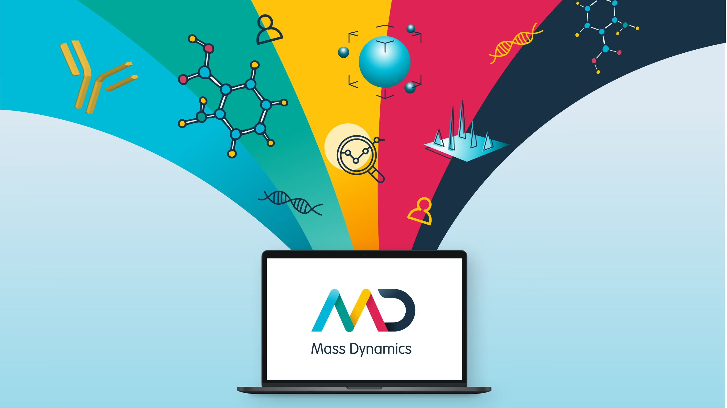
Goals
Brand Strategy
The mass spectrometry industry is visually crowded with conservative, science-led branding that often relies on predictable clichés. Mass Dynamics wanted to stand apart without sacrificing credibility. The name itself carried strong, masculine overtones, creating a challenge around balance, inclusivity, and tone, particularly for a brand targeting a diverse, forward-thinking audience
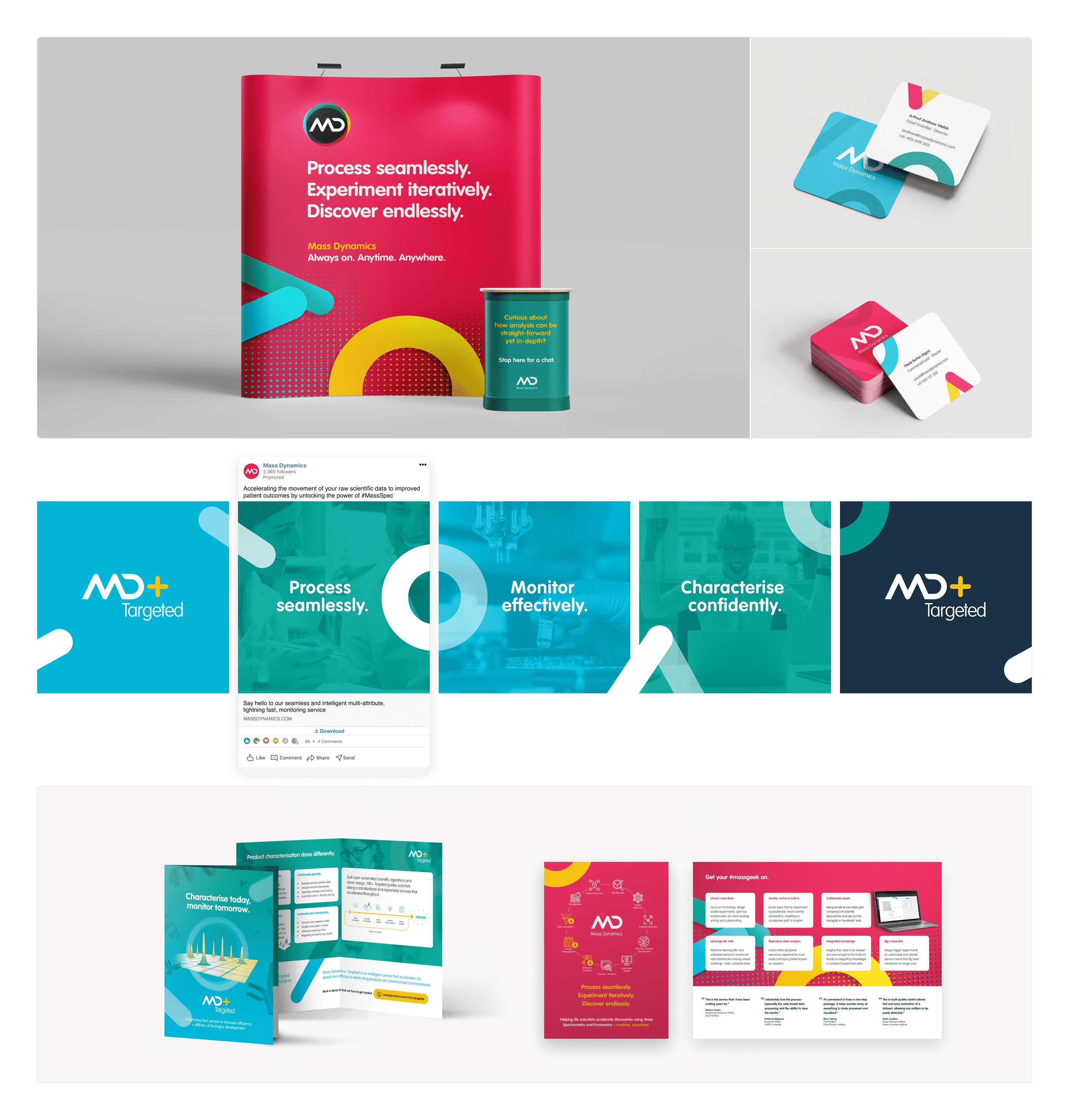
The finished brand is flexible, distinctive, and purpose-built for a modern medi-tech startup. A modular logo system and bold colour palette provide strong recognition across digital and physical touchpoints. Beyond the logo, brand elements were deconstructed into abstract shapes, allowing the identity to scale into UI backgrounds, marketing materials, and future product extensions.
The result is a brand that feels credible yet progressive, ready to support Mass Dynamics as they grow and disrupt their category.



Digital Application
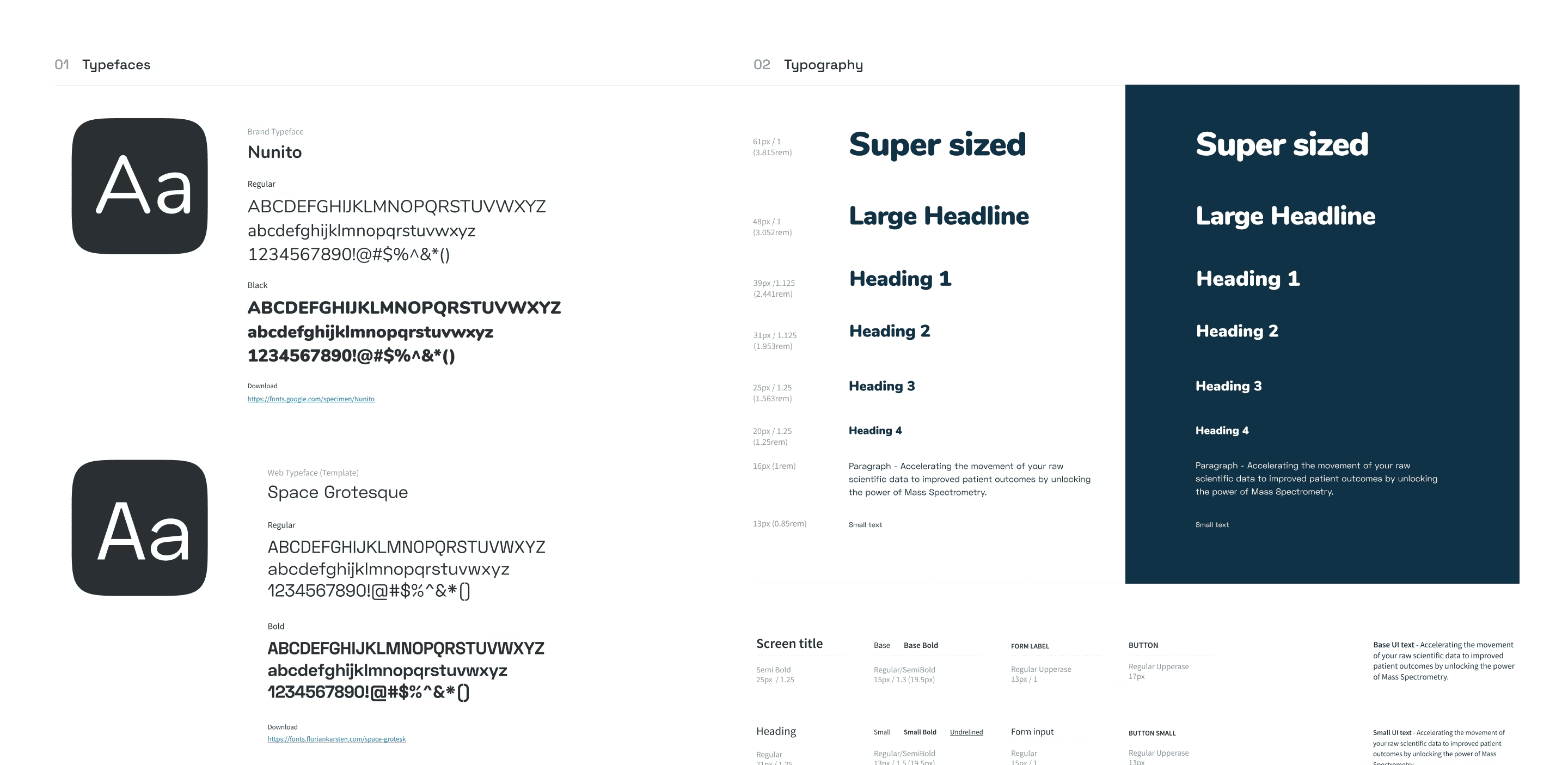
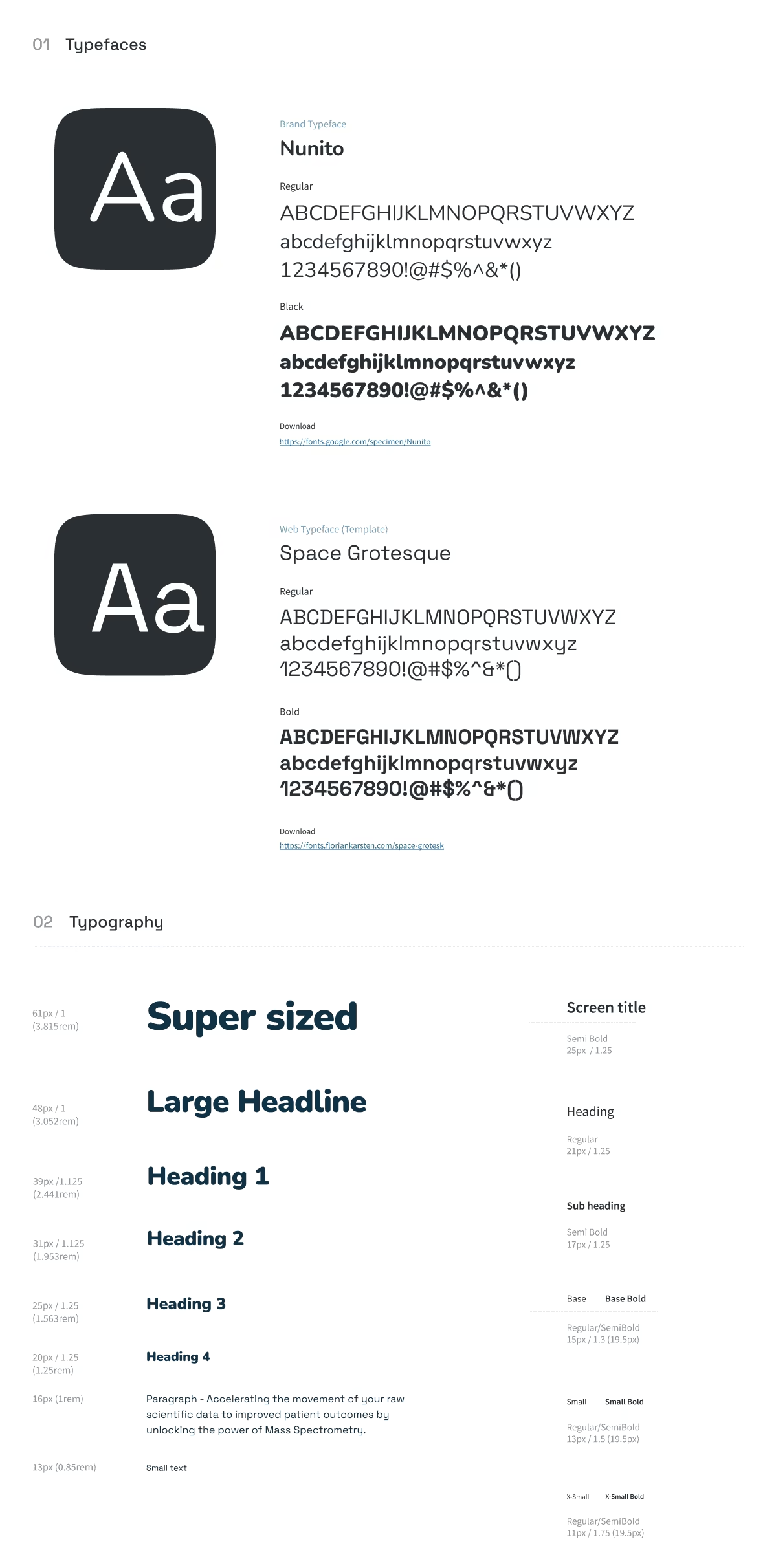
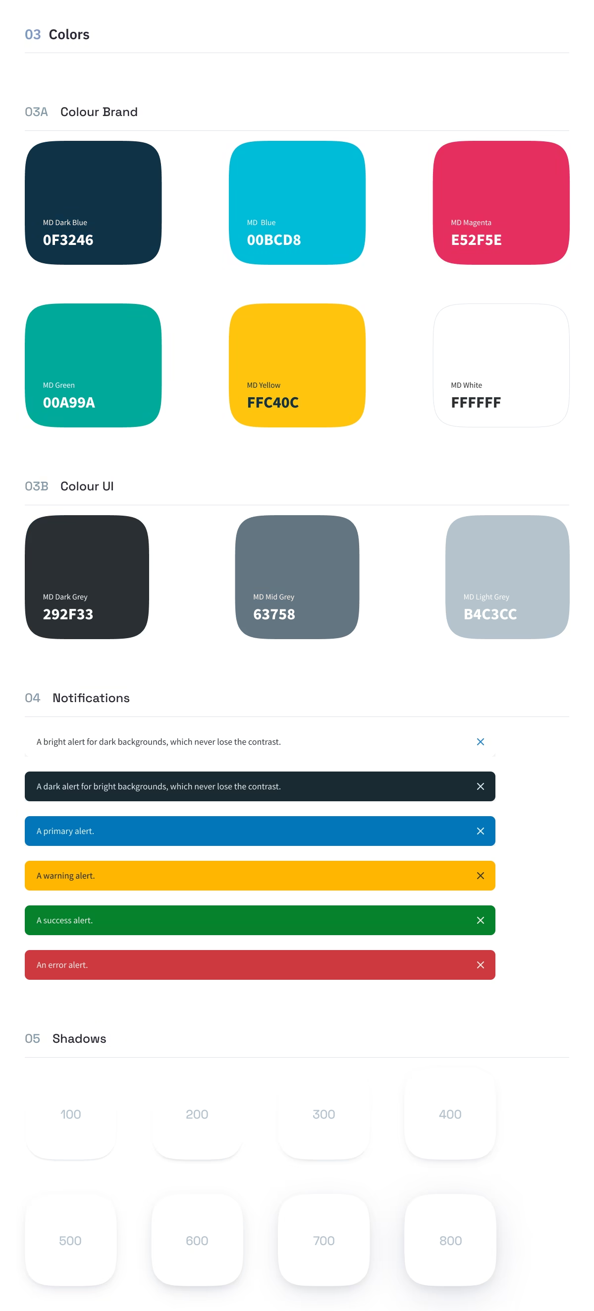
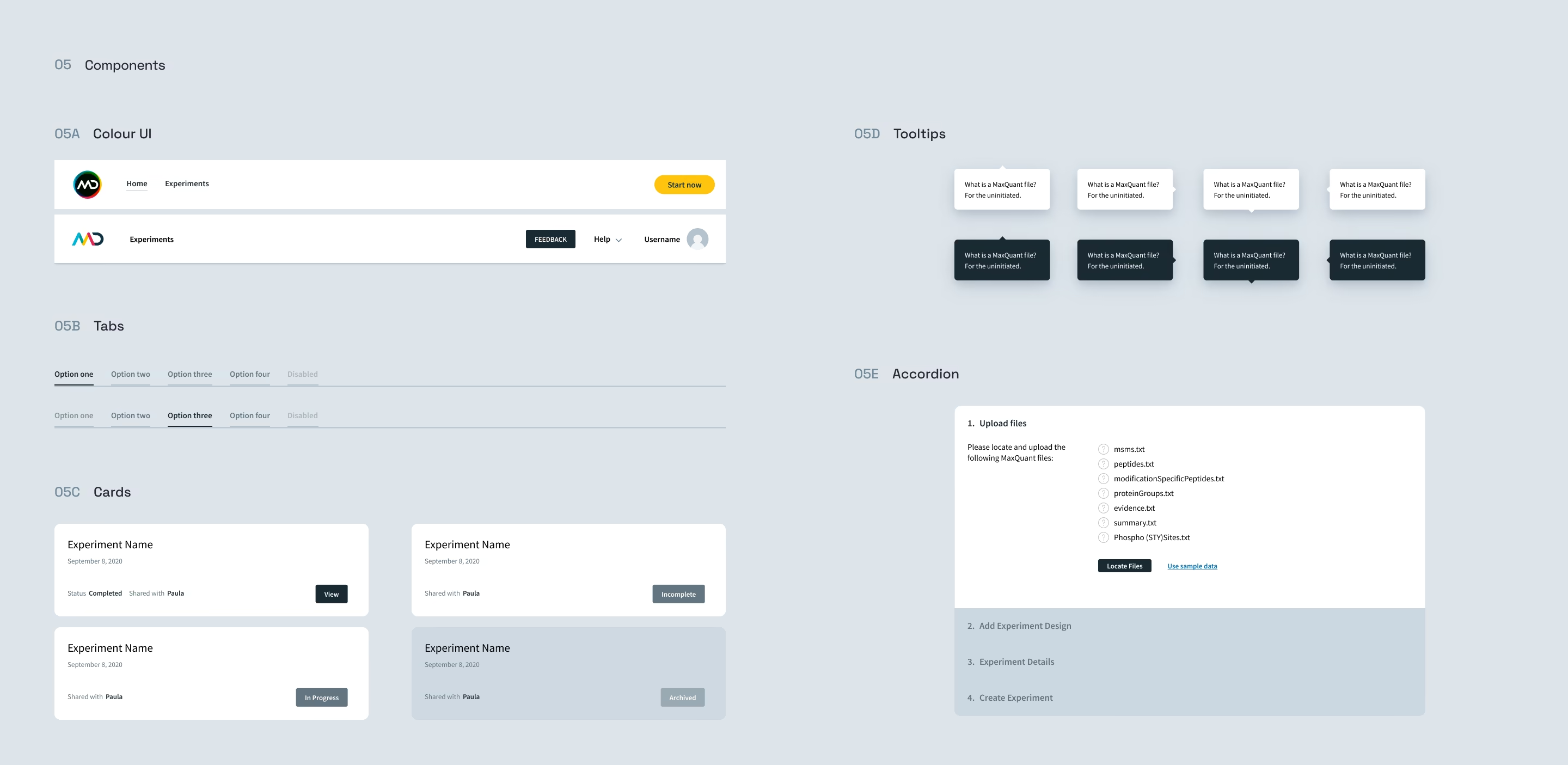
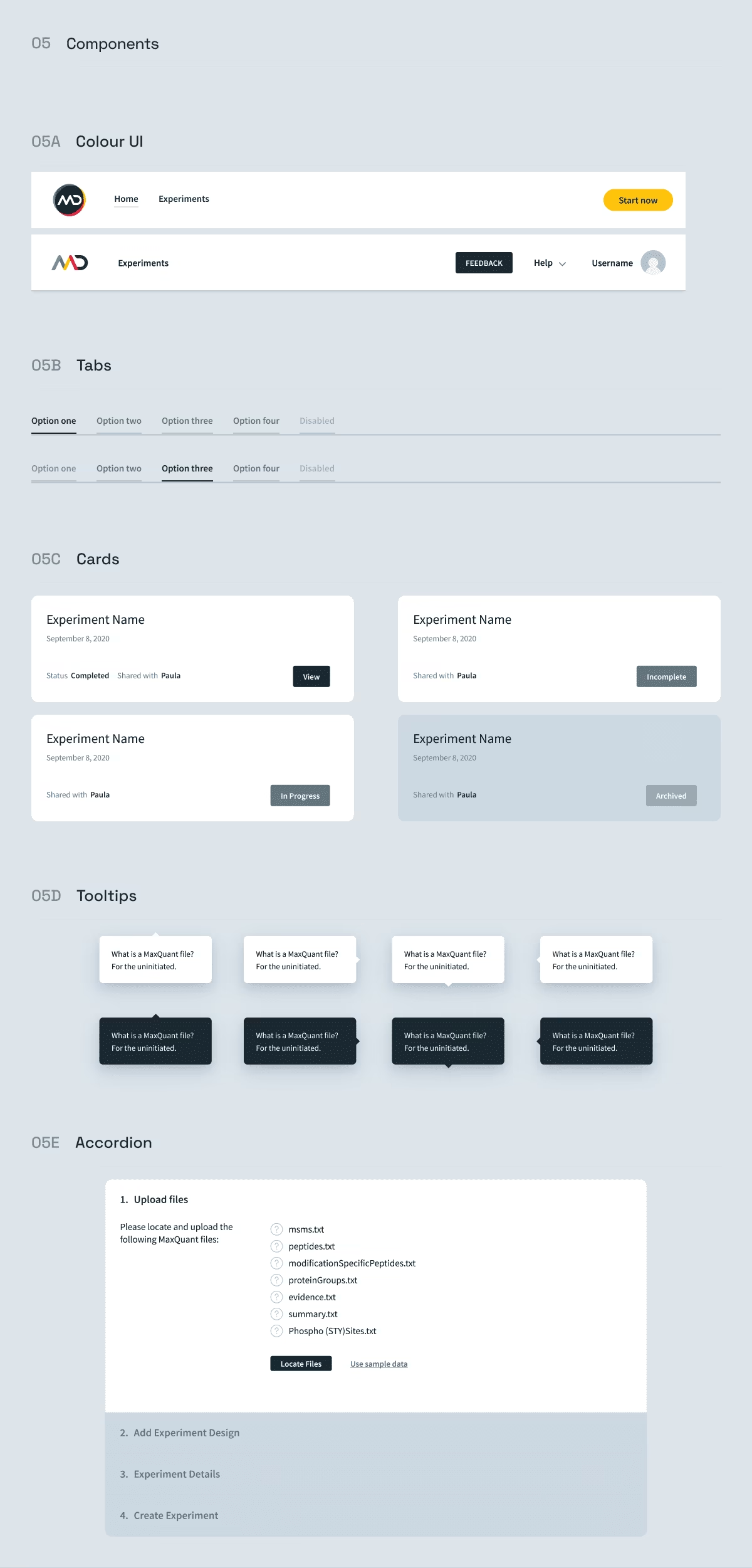
The brand was embedded into the website and SaaS product through a defined typographic system, modular colour system, and precisely aligned UI components. Typography establishes clear hierarchy and rhythm, while the colour system supports meaning, focus, and usability across both marketing and product contexts.
These elements form a cohesive, scalable design system that ensures consistency across every touchpoint. The result is a unified digital experience where brand and product work together seamlessly, ready for ongoing growth and product evolution.

This is a confidential project under NDA
Client context
Harvest Technology builds low-latency remote streaming solutions for industries where live video, audio, and data need to travel reliably from the field to decision-makers. NodeStream is their flagship SaaS platform, enabling real-time remote operations across defence, mining, offshore, and industrial environments.
Our Role
Bluntmedia embedded directly into Harvest’s product workflow, collaborating day-to-day with engineers and stakeholders. We focused on understanding the realities of remote streaming, including latency, signal reliability, multi-input management, and operator usage during live sessions.
Want the full story?
We can walk you through the project in a private video session. Get in touch.